
In developing our game, we wanted to pay tribute to one of the most influential artistic movements of the 20th century: the Russian avant-garde. Born in the turmoil of the 1917 Revolution, this movement broke with classical conventions and imposed a bold, geometric and resolutely modern visual language.
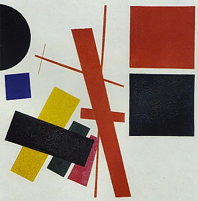
Mixed Feelings, 1916, Kazimir Malevich, Yekaterinburg Museum of Fine Arts.
The Russian avant-garde, a revolutionary art
Unlike the realistic and detailed style of the late 19th century, the avant-garde favoured stripped-down forms, striking contrasts and vivid colours. This movement did not merely seek to transform art: it also aimed to make it accessible to everyone, in a Tsarist Russia where illiteracy was widespread.
Among its emblematic works are:
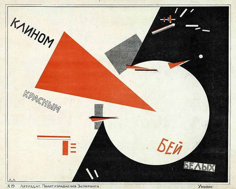
“Beat the Whites with the Red Wedge” by El Lissitzky, a symbol of geometric abstraction evoking the struggle of the Bolshevik Red forces against the White armies.
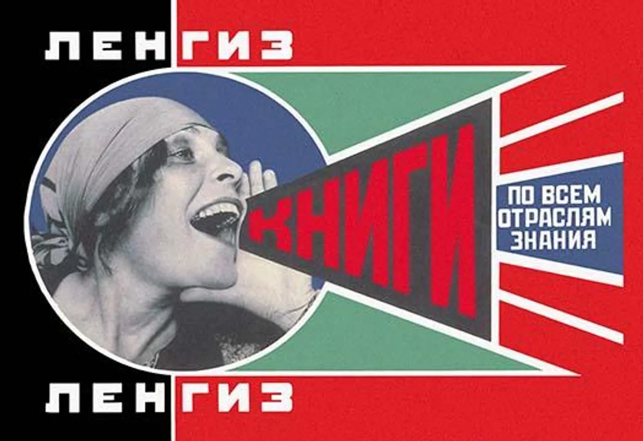
The “Lengiz” poster (“Books in All Branches of Knowledge”), in which text and image merge to create a powerful message.
An art form reflected in propaganda posters
The Bolsheviks quickly adopted this style for propaganda, moving from an inflated classicism to Cubist compositions and then to a radically new visual language.
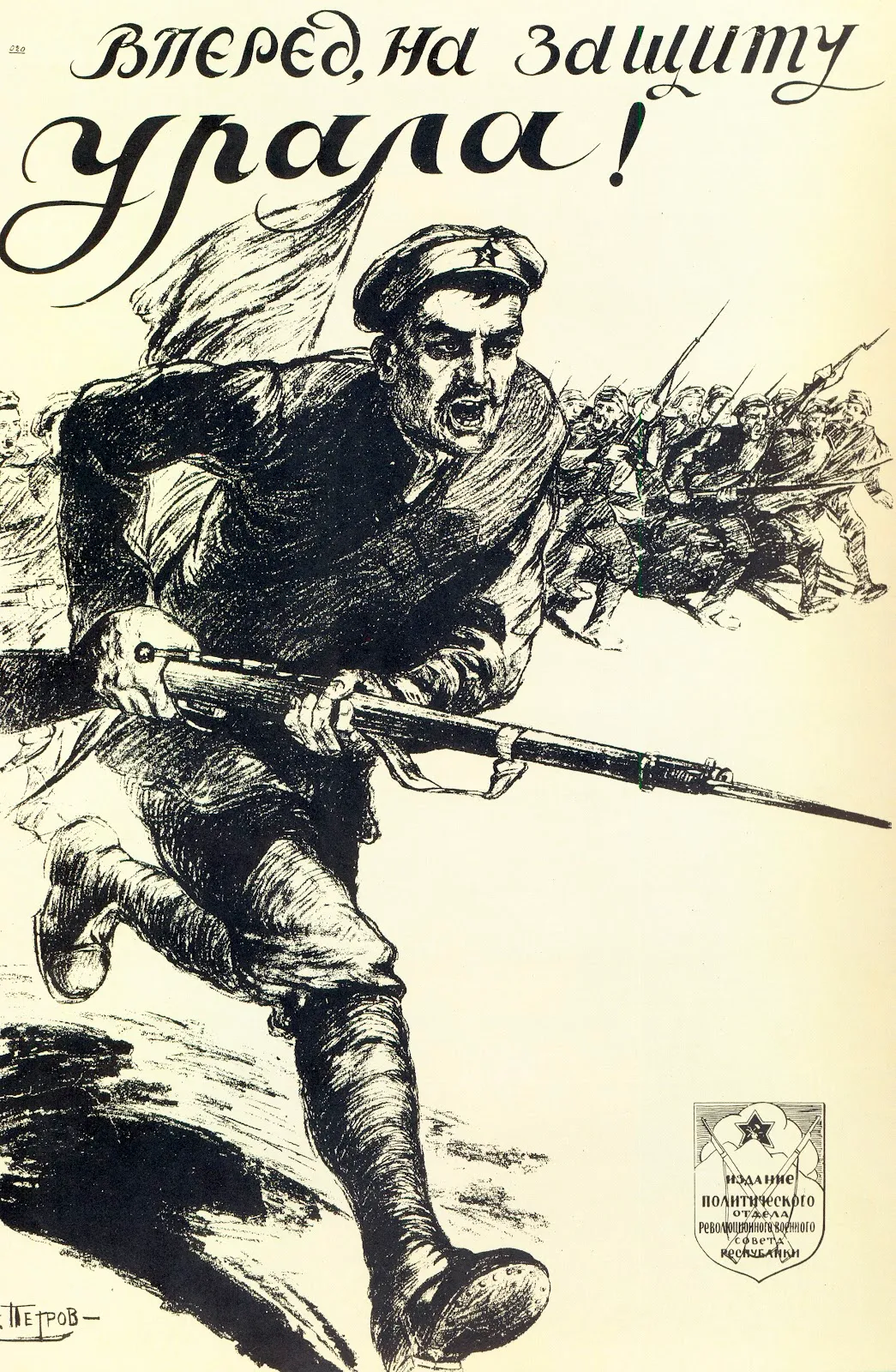
“Forward for the Defence of the Urals” poster by Alexander Apsit, Moscow, 1919, still in a largely classical style.
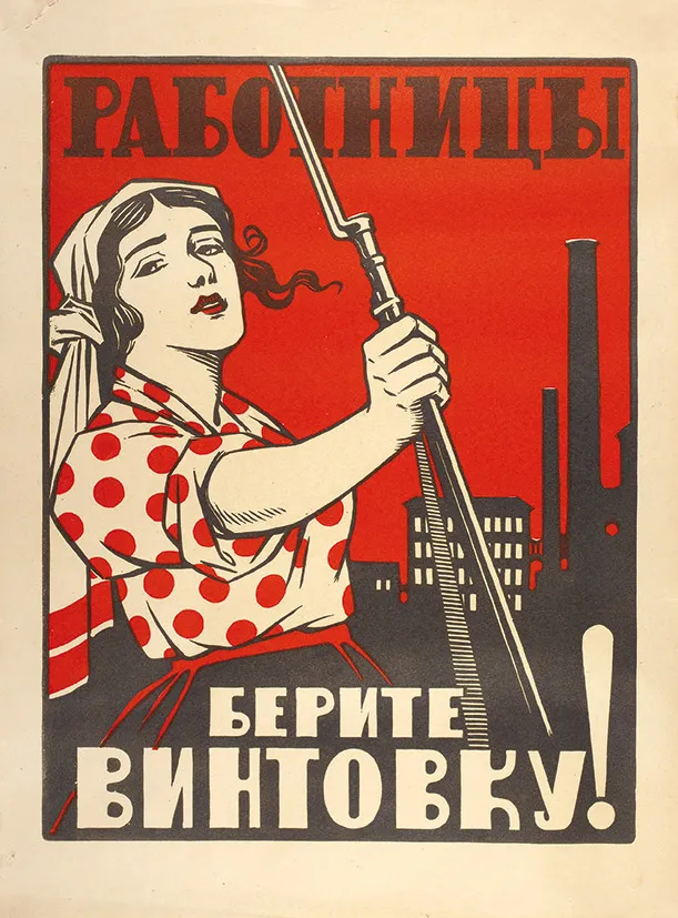
“Women Workers, Take Up the Rifle” poster, created between 1917 and 1921, author unknown. More square shapes and straight lines begin to appear.
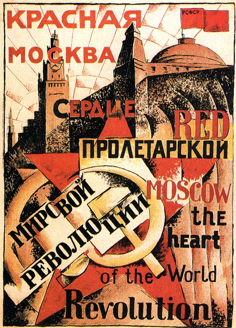
“Red Moscow, the Heart of the Revolution” poster, Vkhutemas, Moscow, 1921, where straight lines are even more prominent.
Two visual styles for two visions of the world
In our game, we offer two distinct graphic modes reflecting this artistic and historical evolution.
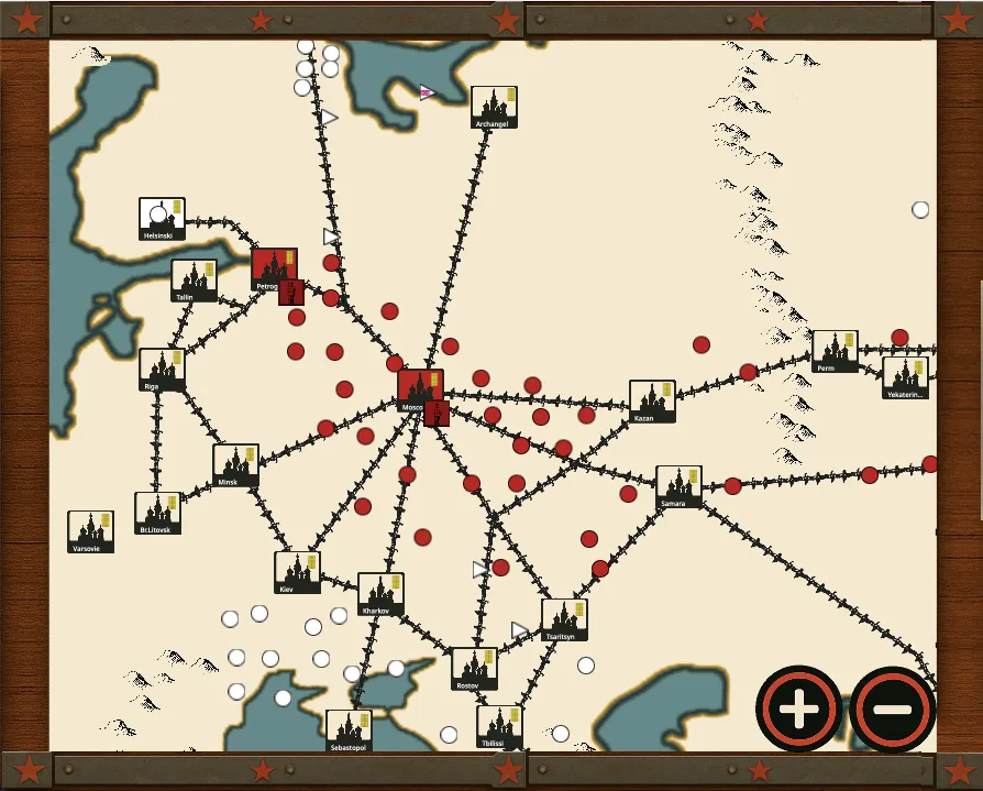
1. The “classic” mode
It is inspired by steampunk aesthetics and Victorian maps:
- restrained but evocative settings: metal plates, raw wood and discreet red stars;
- cities, railways and mountains represented with a concern for realism;
- deliberate simplicity recalling the popular craftsmanship of the period.
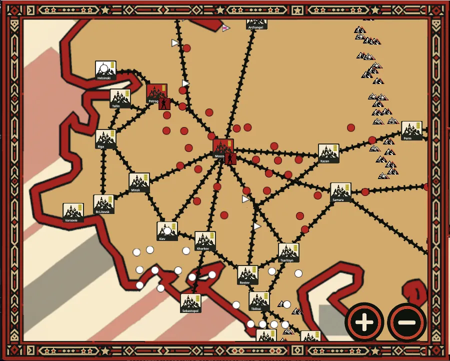
2. The “avant-garde” mode
This mode is based on straight lines, geometric shapes and a reduced but highly contrasting palette:
- deliberate minimalism: where the classic mode offers eight mountain icons, the avant-garde mode uses only two;
- neighbouring countries disappear in favour of a focus on the Tsarist Empire;
- this concentration strengthens the sense of immersion in an isolated and revolutionary Russia.
The challenge: not sacrificing gameplay to aesthetics
The Russian avant-garde pushes abstraction to the edge of readability. To avoid losing the player, we had to find a balance:
- retain clear landmarks — cities, soldiers and railways — while stylising them;
- simplify without obscuring: borders become thick lines and factories assemblies of rectangles, but their function remains intuitive.
It is up to you to tell me whether this gamble works.
Subscribe to our newsletter to discover the next visual and gameplay developments in advance!