
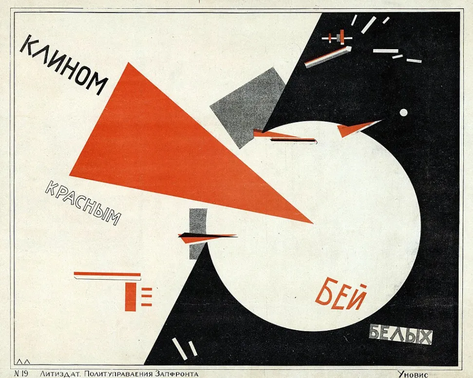
As part of the development of our game Russia 1917, we sought to create a strong visual identity inspired by Russian Constructivism and El Lissitzky’s famous work “Beat the Whites with the Red Wedge”. This composition refers to the Bolsheviks’ victory over the White armies. One of the essential aspects of the game is to produce graphics that are beautiful, readable and consistent with this artistic direction.
The objective of the game is simple: move armies to control cities, receive reinforcements and conquer territory. However, the addition of specific strategic elements makes the gameplay more complex.
The Trans-Siberian Railway, for example, imposes a linear form of combat and limits tactical options. Foreign forces also attempt to conquer territory and support the White armies.
The player must also make political decisions. Developing the International makes it possible to receive support from workers in Western countries and thereby weaken foreign interventions. The Congress of the Peoples of the East, held in Baku in 1920, can help unite the peoples of southern Russia. Signing the Treaty of Brest-Litovsk or deciding to attack Poland also plays an important role.
Searching for an appropriate visual representation
We explored different ways of representing the war that could both inform players about how the conflict is unfolding and provide a striking visual language reflecting the strategic nature of the game.
We started from a first generated image:
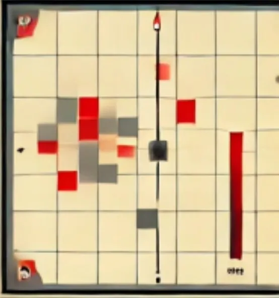
Here are some of the directions we then explored.
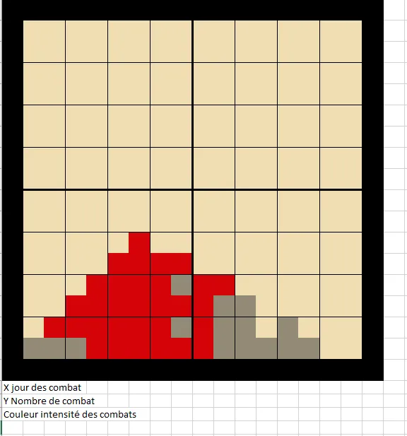
Representing the intensity of the fighting
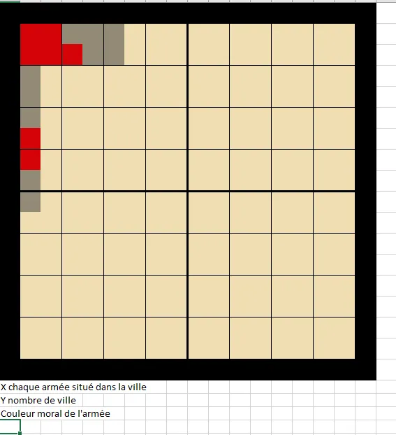
A grid-based graphic in which the intensity of the fighting is represented by colours ranging from grey to bright red. This makes it possible to identify the main conflict zones immediately.
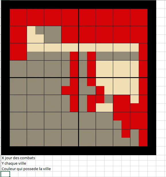
Showing control of cities over time
A representation system shows the gradual control of cities by the Red and White factions, symbolised by blocks of different colours.
Representing army morale
Another graphic represents the morale of armies according to their position and the cities they occupy, adding another dimension to the strategy.
Next steps
We have not yet found the perfect approach that combines all the necessary information with the visual beauty we are looking for. These experiments nevertheless provide a solid foundation for refining our approach.
Our goal is to achieve a representation that gives the impression of isolated islands of conflict while maintaining an aesthetic consistent with the spirit of El Lissitzky.
The visual development of Russia 1917 is a fascinating process combining history, strategy and graphic art. We are convinced that this fusion of functionality and aesthetics will create an immersive and distinctive experience for players.
Update
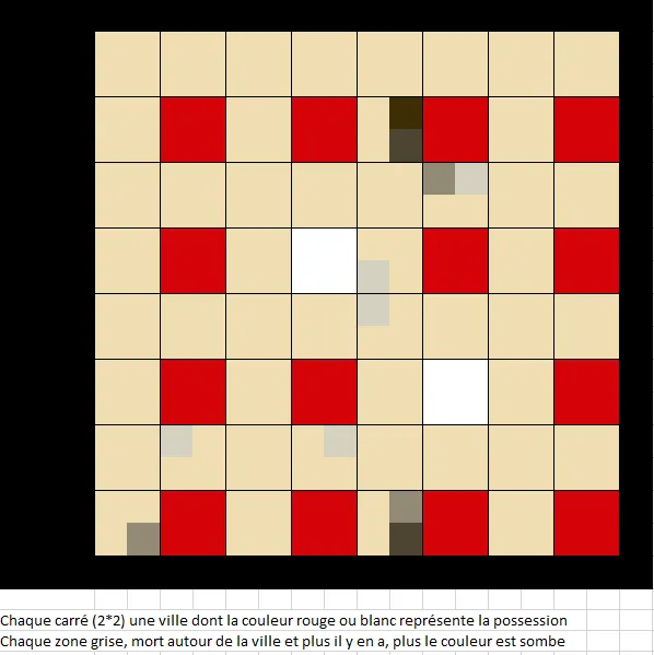
I think I have found the right presentation. Each square on the map represents a city: red or white indicates the faction controlling it. The grey areas surrounding it represent the number of casualties; the darker the colour, the greater the losses.
Subscribe to our newsletter to follow the next stages in the development of Russia 1917.